
DOJO+ is a comprehensive platform created to support Jiu-Jitsu academies in streamlining their daily operations, improving student engagement, and scaling their memberships. The platform serves as a centralized tool for scheduling, attendance tracking, communication, and student progression.
Setting the Mat: Why DOJO+ Was Built
My role involved owning the design process end to end by conducting research, building wireframes, prototyping, designing the visual interface, and creating a scalable design system to ensure brand consistency, accessibility, and responsiveness across devices.
Leading the Design Grapple
Strengths
Exclusive focus on the martial arts community for networking and progress tracking
Weaknesses
Problem Statement - The Submission Hold of Bad UX
Jiu-Jitsu academies struggle with managing daily operations due to reliance on manual tools and disconnected apps. This leads to missed payments, inefficient scheduling, poor communication, and low student retention. Existing solutions in the market are either too complex or too expensive for smaller gyms, leaving a gap for a simple, affordable, and user-friendly platform tailored to martial arts academies.

Tapping Into Research
My process began with qualitative and quantitative research. I launched a survey with over 65 responses from members of 10 different academies to identify broader patterns. This was supported by a competitive analysis. To guide IA decisions, I used card sorting and affinity mapping was applied to synthesize research insights. Throughout the process I validated concepts through remote usability testing.
Know Your Opponent

I conducted a competitive SWOT analysis of three platforms: Mindbody, BJJ Beltchecker, and Marune.

Beltchecker
- Validating BJJ belts within a community voting system
- Cluttered user interface and
- No mobile app
Rolling Through the Journey Map

Know Yourself - DOJO+ SWOT
Limited belt validation, technical issues, and lacks event details
50%
of users like community suggested verifications, the other half prefer rank-based system
of users think it’s important that the verifying come from a higher rank
83%
User vs. Interface
Thanks for Rolling Through
Mindbody
- Wellness class finder
- Logs various fitness activities
- Lacks depth in martial arts content
60%
of users have used the DOJO+ application
86%
of users find rank important in trusting verifications votes


75%
of users share their martial arts journey via social media
90%
of users think it’s important to be a part of a martial arts community
Marune
- Community engagement for MMA
- Offers workout routines and guidance
- Requires a subscription for full access
Opportunities
Expand social media presence and community features to attract users and sponsors
Threats
Risk of belt ranking manipulation and user disputes due to subjective skill assessments
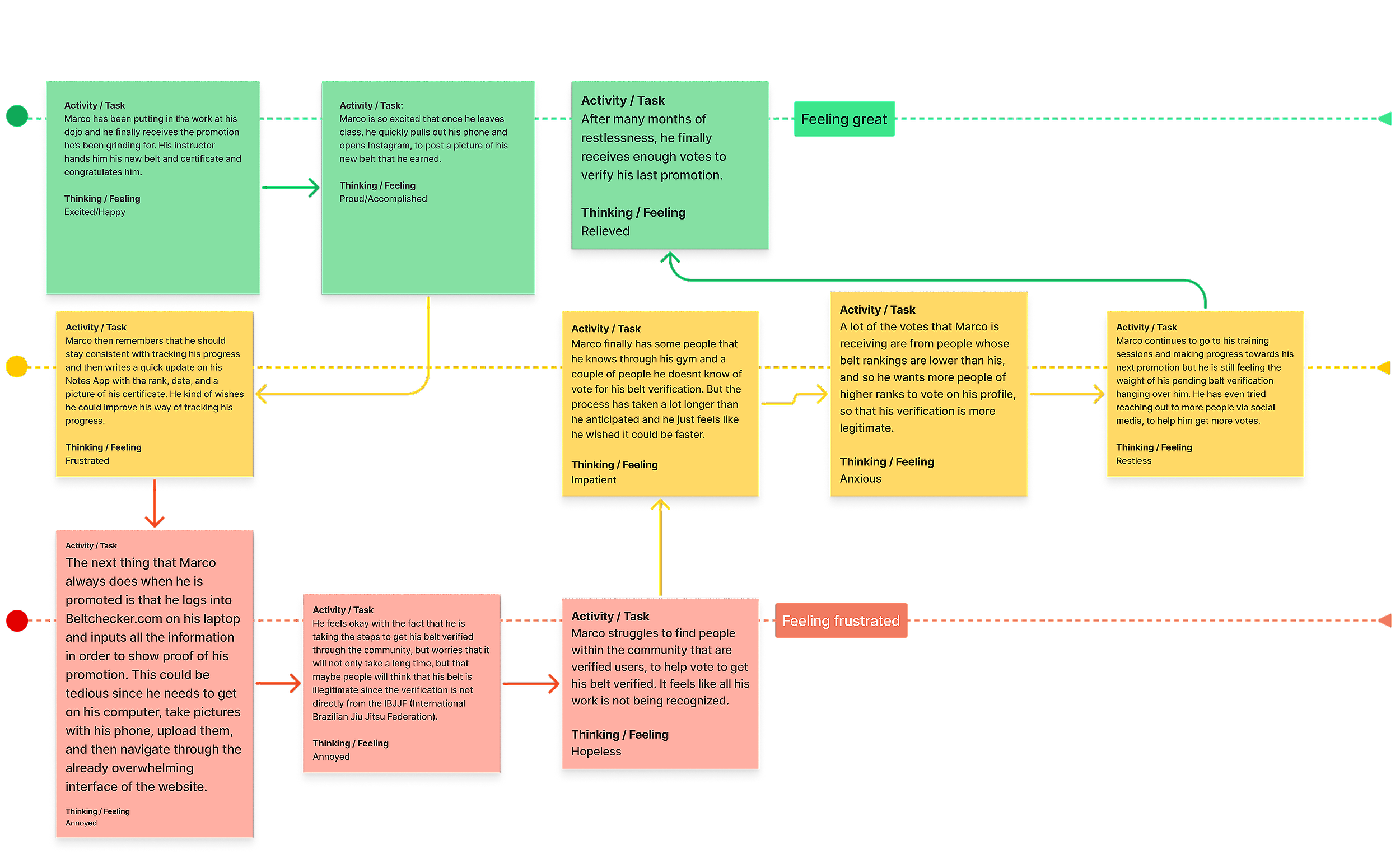
The journey map outlines how students move through the process of earning and verifying their belt promotions within the martial arts community. It highlights the key steps from training and preparation, to receiving promotion, to having that achievement recognized and validated by their peers and instructors. This helped show where students feel motivated where they face uncertainty and how DOJO+ can support a smoother and more trusted promotion experience.

This helped me identify pain points and turn them into opportunities for improvement. I sketched out initial screen ideas to address key issues, then informed the creation of a unified design system to ensure consistency, scalability, and accessibility across the platform.

We conducted usability testing in two phases, mid-fidelity and high-fidelity. Feedback showed that owners appreciated the simplified scheduling process and parents liked the visual clarity of the schedule and attendance views. Students responded well to the gamified belt progression visuals. Some users struggled with the initial dashboard layout. Terminology also needed simplification to align with user expectations.
Finishing Moves: The Final Design

Thank you for taking the time to read my case study. I hope it gave you a clear look into my design process, problem solving approach, and how I bring thoughtful user centered experiences to life. I would love to connect and hear your thoughts or talk more about my work!