Black and white image of a woman's face with makeup and styled hair.

Indtroduction

Pininfarina is a design house for a variety of industries including architecture, transportation, interiors and furniture, industrial design, lifestyle products, and design strategy, and worldwide known for its automotive industry. They have collaborated with well-known brands such as Coca-Cola, Samsung, Alfa Romeo/Ferrari Miami Beach, and Jacuzzi

I began this project by doing research on the brand. After speaking to stakeholders, I determined what my challenge would be based on the company’s needs and goals. The brief entailed creating a mobile app for Pininfarina that provides a “wow factor” to entice people to download the app.


The Design Challenge

Always keep Pininfarina's values: Purity, Elegance, Innovation, and Passion at the heart what whatever I design. Pininfarina doesn't design automobiles which is what the company is arguably the most well-known for. They want to showcase how they design beyond automobiles by being a 360 Design House. Additionally, they want to have more visibility and become more fresh and fun so they can attract more people that could ultimately be clients.


Diagram showing the connections between products and services, pain relievers, gain creators, gains, pains, and customer jobs, with several points detailed under each category.

MVP

Hypothesis Statement


Create an app where users can gain inspiration and share their designs in an interactive manner.

Jobs to Be Done

When I go on the Pininfarina app I want to learn about the process behind innovative designs so I can feel inspired to create, digitally interact and view product designs.

Problem Statement

Design lovers need a way to interactively learn about the processes behind a design so that they can be inspired to innovate their own because they struggle to find resources that will allow them to engage creativity.

We believe providing an interactive learning experience for design lovers achieves continued engagement. We will know we are right when users incorporate what they learn from our app into their own designs, and they challenge their circle to do the same.

The goal was to understand how users engage with design on a digital platform. The research included creating an app that would be exclusive and entice people to return, include the story behind the design/the process, and offer inspiration as well as the ability to share with others. Users want designs that tell a story, and give and share inspiration.

A digital profile card featuring a portrait photo of Chris Lee, a 31-year-old architect from San Francisco, CA. The profile includes sections on his bio, needs, pains, brand affiliations (social media icons), and a quote about design.

Wireframing

With my low-fi wireframes, I conducted my first usability tests. These multi-task tests directed the first round of iterations which mostly centered around the wording on our content, and keeping language consistent throughout the app. Then, once I completed the mid-fi wireframes, I conducted another round of testing. Compared to the low-fi testing, I saw smoother interactions and received a lot of feedback on desired features.

A series of hand-drawn wireframes for a mobile app design, illustrating storyboard sketches for different screens such as a homepage, design challenge, upload interface, and design preview.

User Flows

My prototype consists of three user flows. In the first flow, the user will identify a Pininfarina design challenge of their choice and accept the challenge.

Flowchart illustrating the process of using a mobile app, starting with opening the app, then logging in or not, leading to different actions like design feed, post, profile, save, and ending.
Mobile app user interface with a project management design screen. Top shows the app name 'Pinnfarnina' and options for 'Design' and 'Redesign.' Main area displays two project cards with titles, icons for favorite and user. Navigation bar at bottom includes icons for Home, Search, Add Project, Challenge, and Pinnfarnina.
Mobile app screen with a blank project image, icons for sharing, liking, and bookmarking, a section indicating 'This project is a Redesign,' and a button labeled 'Accept Challenge'. Navigation bar at the bottom with icons for Home, Search, Add Project, Challenge, and Pininfarina logo.
User profile page with user named Chris Lee, displaying 200 claps, 78 followers, and 82 following. Navigation bar at the bottom includes Home, Search, Add Project, Challenge, and Pininfarina icons.

In the second flow, the user will view and save a design project that inspires them and navigate to where their saved designs are located.

Flowchart diagram showing a decision process for using a mobile app, with steps including login, design feed, redesign challenge, industry choice, briefing, acceptance, and ending.
Mockup of a mobile app interface named 'Pinnfarnia' with tabs labeled 'Design' and 'Redesign,' featuring sections for project titles, icons for liking and user, and a bottom navigation menu with icons for home, search, add project, challenge, and Pininfarina branding.
Screenshot of a mobile app interface titled 'Redesign Challenge' with two tabs labeled 'Pininfarina' and 'Community'. The interface features a grid of eight boxes each labeled 'Industry' with an icon of a monitor, arranged in two columns and four rows. The bottom navigation bar contains five icons with labels: Home, Search, Add Project, Challenge, and Pininfarina.
Mobile app interface titled 'Redesign Challenge' featuring two tabs 'Pinnovarina' and 'Community.' The 'Pinnovarina' tab is active. Multiple sections labeled 'Industry' with icons, and a collapsible section titled 'INDUSTRY (selected)' listing brief descriptions. Bottom navigation bar with icons for Home, Search, Add Project, Challenge, and Pinnovarina.
Mobile app interface with sections titled 'Brief One,' 'What ours looked like,' and 'Our Process,' showing placeholders for images and text, with a button labeled 'See Full Project' and bottom navigation icons for Home, Search, Add Project, Challenge, and Pininfarina.

In the third flow, the user will go through the process of uploading and publishing a new design.

Flowchart diagram illustrating the process of designing a mobile app, starting with opening the app, logging in, deciding whether to design or redesign, inputting design information, submitting, or ending.
Screenshot of a mobile app called Pinnfarnina displaying tab options, project cards with hearts and user icons, and navigation menu with icons for home, search, add project, challenge, and Pinnfarnina.
Mobile app screen with upload feature, buttons labeled 'New Design' and 'Redesign', and the description explaining their functions. Bottom navigation bar includes icons for Home, Search, Add Project, Challenge, and Pinifarina logo.
Screenshot of a mobile app interface for uploading images, showing a grid of placeholder images, with options to 'Choose Album' and navigate 'Close', 'Next'.
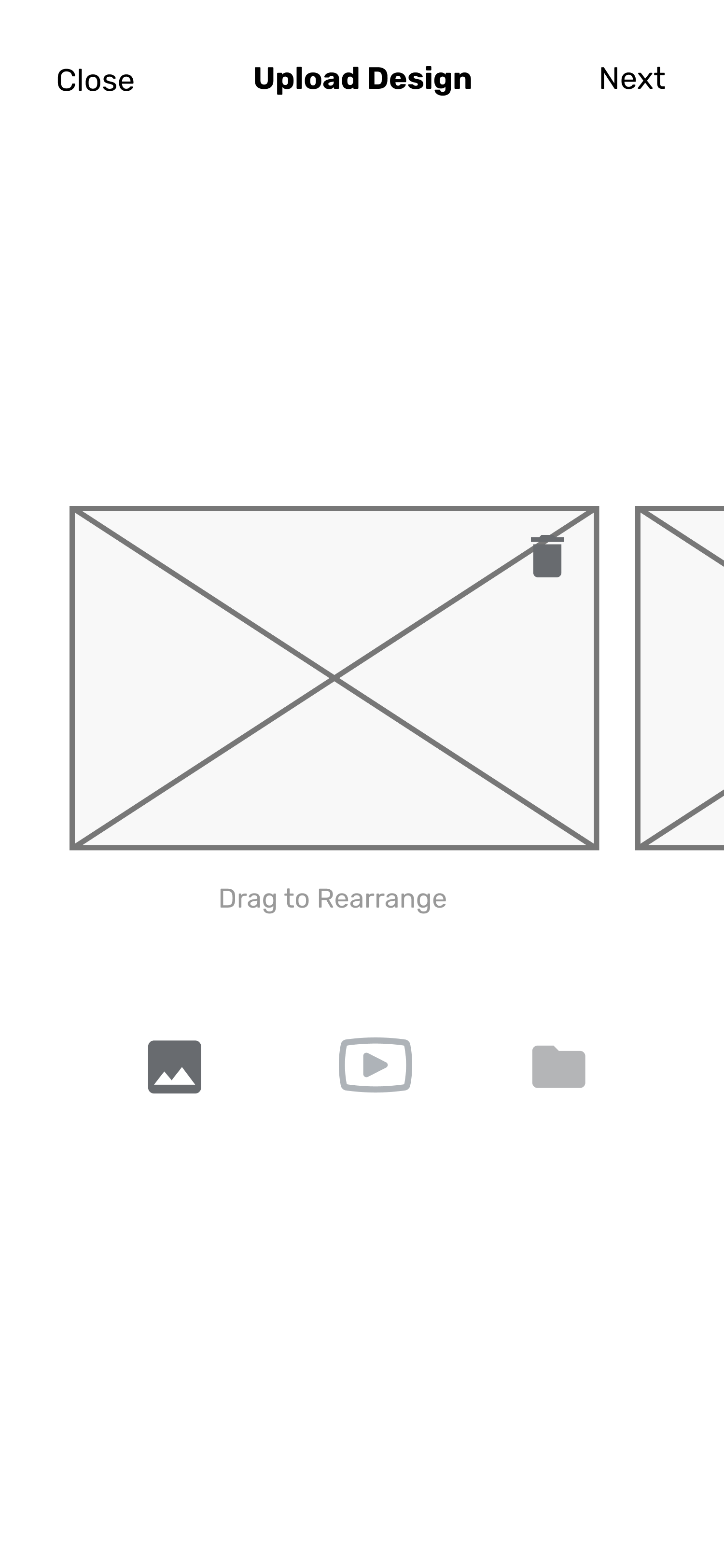
Screenshot of a mobile app interface for uploading a design, with options to close, go to next, and drag images for rearranging, featuring three icons at the bottom for gallery, video, and folder.

Expanding Brand Influence Through a Digital Solution Focused on Engagement and Growth

Final Design

Empty draft editing screen with options to add title and description, toggle to allow redesign, and buttons for preview and publish.

Once I was satisfied with my ideas, I created a site map to understand how these ideas would be implemented and the relationship between each idea and how we could present the information to the user. The stakeholder already had certain branding assets on their website which I was able to use as inspiration. When building out the design system for mobile, I tried to stay true and consistent with the company's design values. Once I completed our hi-fi prototype, I did another round of testing.

Flowchart illustrating a website structure with sections for Search, Upload Design, Design Challenge, Profile, and Pininfarina. Red boxes indicate key pages such as Upload New Design, Upload Redesign, My Challenges, Redesign Challenges, Uploaded Designs, Saved Designs, Projects, The Pininfarina Process, and About. Gray boxes indicate sub-sections like Redesigns from Pininfarina, Briefs by Industry, and Redesigns from the Community.
Design mood board featuring color palette, components, buttons, logos, iconography, and images of modern architecture and technology products.

For the hi-fi prototype, I conducted five concept testings where I would walk the user through the prototype while they explain their perceived concept and functionality of a screen. This guided me through the final round of iterations which included minor but important details that would enhance the user experience.

A collage of mobile app screens showcasing various design and development projects, including architecture, yachts, headphones, and real estate listings.
Collection of mobile app interface screens for a design challenge app, showcasing features like project creation, file upload, preview, and browsing different yacht and nature-themed images.

Next Steps

Include an introduction screen to allow users to understand exactly how the app works, build out the pages that weren’t included in the 3 flows within this project. Thank you for taking the time to read my case study. I hope it gave you a clear look into my design process, problem solving approach, and how I bring thoughtful user centered experiences to life.

View more projects